First impressions happen quick.
A tap or click will make it stick.
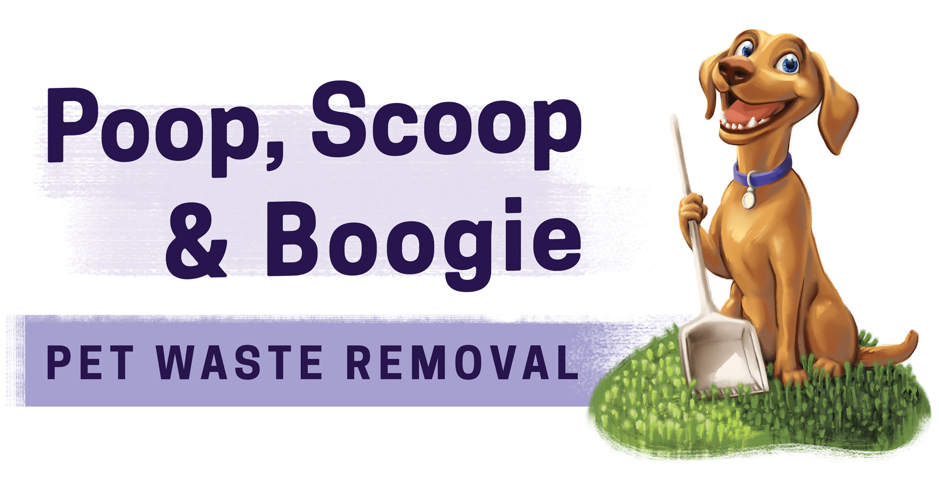
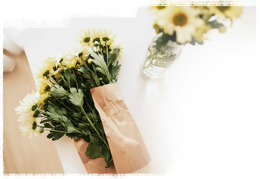
Poop, Scoop & Boogie needed a site that didn’t stink, so I designed them a brand that cuts through the crap.
The pet waste pickup industry is a quirky niche. It doesn’t need to pretend it’s Wall Street. Brands that lean on bold illustration and sharp taglines feel more approachable – they rise above the crowd of cookie-cutter logos and overused sales clichés.
The client came with a clever name and the spark of an idea for a local service. What he needed was everything else, a brand, an offer, and a site to bring it to life. I built it from the ground up: voice, visuals, structure, and website. Behind the scenes, I develop in Webflow, optimize for Google and set up social accounts with one-click booking.
What started as a scrappy idea is now a solid presence with a growing local following. At first I wondered, how much demand could there be for a service like this? Turns out, there are plenty of dog owners with poop problems.
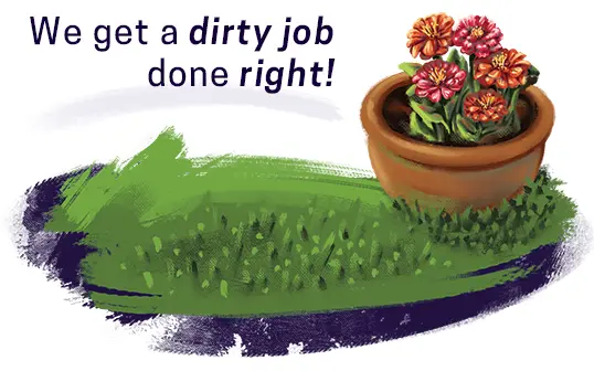
I get to the heart of an offer so that it lands in a glance. The payoff: honesty that earns trust and simplicity that earns attention.
Simply Detailed is a cleaning company with branding that's actually clean – subtle and uncluttered, as straight as their service.
Residential cleaning websites often come wrapped in flashy offers and exclamation points, but this one skips the hype. In just a couple of weeks, we had the logo designed, business cards printed, and a clean, responsive website ready to roll. By week four, we had marketing material hot off the press and early job photos were live across socials.
A company doesn’t need a complicated website to clearly show who they are, or how they help, but the right touchpoints still matter. And it’s a show of trust for a brand to invest time in what others might rush.


My clients bring me a vision,
I turn it into something they point to and say, ‘That.’


In a town known for its quiet nights, Comox Disco imagines evenings worth staying up for.
The average resident of Comox is in their mid-forties with kids and a Costco membership. They’re in the routine of responsibility. This app imagines a way to shake the dust off, with movement, music and social connection.
While this one lives in the portfolio, not the App Store, the design thinking is real. I was assigned to create a prototype that schedules nightlife events in Comox – themed around disco culture, starring a fox in the logo. It was an engaging way to learn new skills and experiment with interaction design. None of the content is real though. Everything from the band videos to the background textures is AI-generated, circa 2023. Here's the weird part: I learned real things making a fake app with fake people, dancing to fake disco.

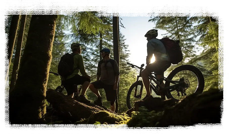
Kuhl Bike’s digital presence is dark and cozy, leaning into the shadows like a ride through the woods.

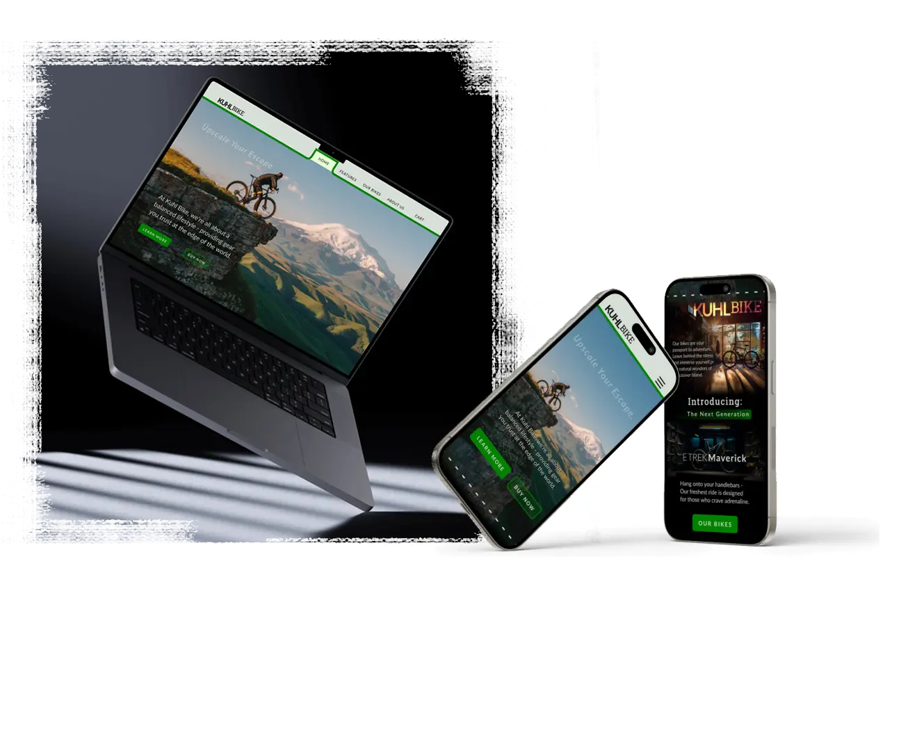
This boutique e-commerce concept was built from scratch as part of a course on user flow and interface design. With layouts ready for desktop and mobile, it’s a functional placeholder for a brand that helps beginners get their bearings in mountain biking.
The prototype walks through product discovery, cart flow, and a mocked-up payment system. A history page with team profiles give the shop a personal touch, and booking an appointment is one click away. The result is a clear snapshot of a brand that could easily plug into the real world.

